Designing Your Web Bot
Customize your Web Chat Bot to match your brand with flexible headers, colors, buttons, icons, and widget settings. Create a more engaging website experience while making it easier for visitors to interact with your business.
Chat360 allows you to customize the appearance and behavior of your chatbot to match your brand identity and improve user engagement. From header settings to widget positioning, the design configuration helps create a consistent and user-friendly chat experience.
1. Header Customization
The header section is the first element users see when they open the chat widget. Proper customization helps establish trust and clearly identifies your bot or support team.
Operator Photo and Name
Upload Profile Image: Upload a square PNG or JPG image to display the bot avatar or your company logo.
Display Name: Set a clear and user-friendly name for the bot (for example: SupportBot by Acme Inc.).
Text Styling and Status Indicators
Text Color and Font Size: Adjust the font size (12px–24px) and select colors that ensure readability.
Online / Offline Status: Display a status indicator to show whether the bot or a live agent is currently available.
Subtitle Text: Add an optional subtitle below the display name (for example: Here to help 24/7).
Why this matters
A well-designed header improves credibility, sets user expectations, and reinforces brand identity from the beginning of the conversation.
2. Colors and Appearance
Customizing the chat widget colors ensures that the chatbot aligns with your company’s branding and visual style.
Site-Wide Color Palette
Primary and Secondary Colors: Define colors for the chat header, borders, and accent elements.
Bot and User Message Bubbles: Set different background colors for bot messages and user messages to visually distinguish conversations.
Text Colors: Choose contrasting colors to maintain readability.
Icons and Interactive Elements
Widget Icon and Logo Colors: Customize the colors of the launcher icon and logo to match your brand.
Utility Icons: Configure colors for icons such as refresh, help, and shortcuts.
Send Button and Typing Indicator: Customize the appearance of the send button and typing spinner.
Background and Overlay
Chat Window Background: Add a background color or pattern behind the chat area if needed.
Overlay Opacity: Control the transparency of the page overlay when the chat widget expands.
Why this matters
A consistent color scheme strengthens brand recognition and makes conversations easier to follow.
3. Button Appearance
Buttons guide users through conversations and encourage interaction. Customizing their appearance improves usability and engagement.
Core Button Styling
Background Colors or Gradients: Choose colors or gradients for quick reply buttons and call-to-action buttons.
Text Styling: Adjust font style, color, and spacing to match your brand guidelines.
Hover and Active States: Configure visual feedback when users hover over or click buttons.
Advanced Button Options
Border Radius and Shadows: Add rounded corners or shadows to make buttons appear more interactive.
Icons in Buttons: Add icons before or after the button label (for example, a phone icon for Call Us).
Why this matters
Well-designed buttons clearly highlight interactive elements and improve click-through rates.
4. Chat Widget Configuration
The chat widget determines how the chatbot appears and behaves on your website.
Launcher and Label Settings
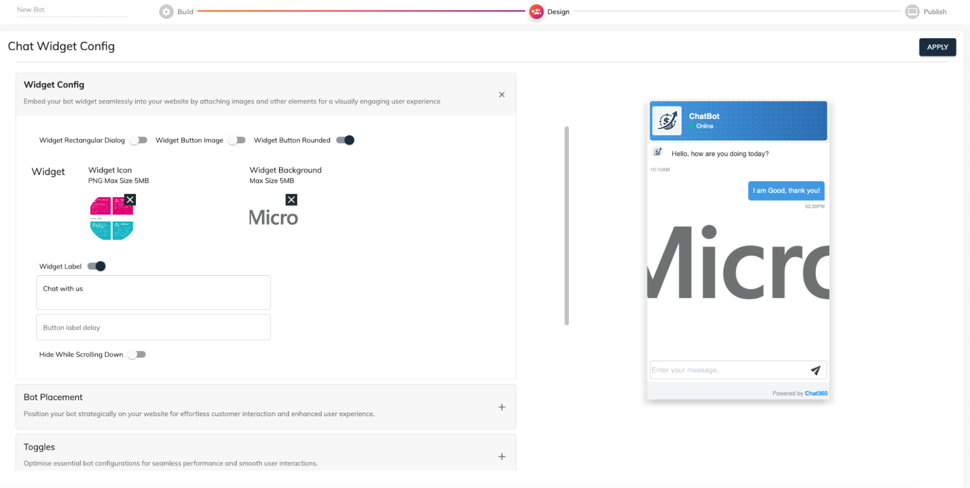
Widget Icon Upload: Upload a high-resolution PNG icon (up to 5 MB) to represent your chatbot.
Background Image: Optionally add a background image for the widget frame.
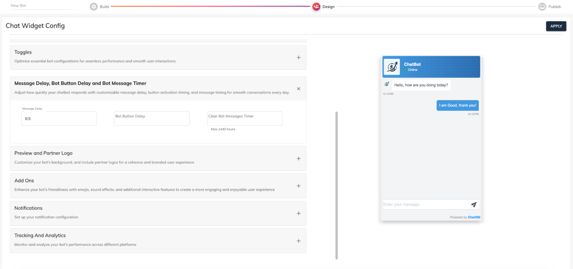
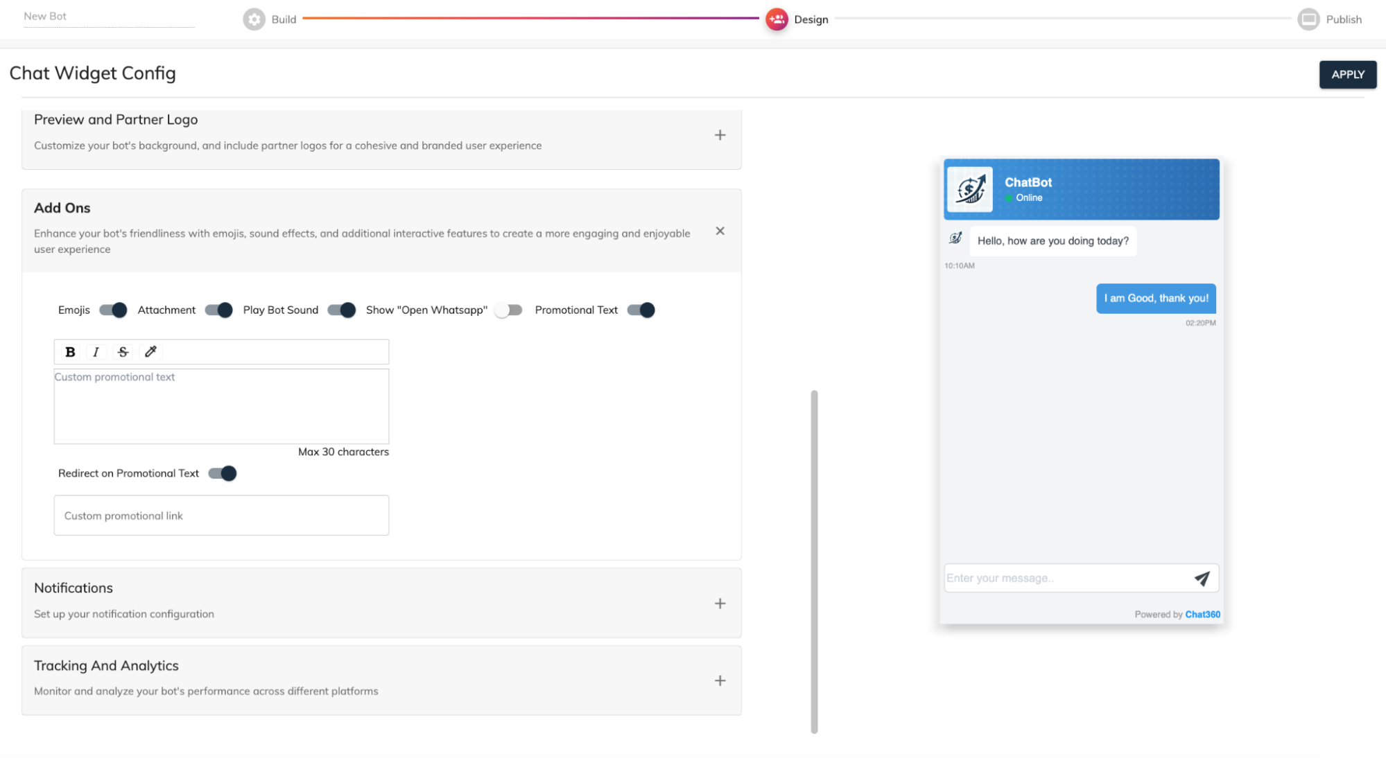
Label Text and Display Delay: Add a call-to-action message such as Need help? Chat with us! and configure a delay before it appears.
Behavioral Settings
Hide on Scroll: Automatically hide the widget when users scroll down the page.
Auto-Open Conditions: Configure the chat window to open automatically after a set time or when users visit specific pages.
Widget Display Mode: Choose whether the widget starts minimized or expanded.
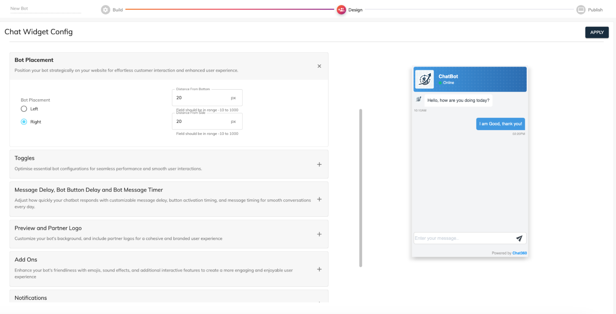
Positioning and Spacing
Side Placement: Place the widget on the left or right side of the screen.
Offset Settings: Adjust the distance from the bottom and sides of the page to prevent overlap with other elements.
Responsive Configuration: Configure different widget positions for desktop and mobile devices.
Why this matters
Proper widget placement ensures that the chatbot remains visible and accessible without interrupting the browsing experience.
Best Practices
Using the Design Your Bot Interface settings effectively allows you to create a chat experience that:
Matches your brand identity through consistent colors, logos, and typography
Improves usability with clear buttons and readable text
Encourages engagement with well-timed widget triggers and visible call-to-actions
Maintains consistency across multiple communication channels such as web chat, messaging apps, and voice interfaces